
通常、項目が選択されると青色でハイライトされます。
このハイライトカラーを変えるには ControlTemplate を変更します。
WPFでは、ControlTemplate の Trigger 要素とSetter 要素で選択時のハイライトカラーを任意の色に設定します。
また、Silverlight では、VisualStateManager 要素の VisualStateGroup 要素内で選択時のハイライトカラーを設定します。
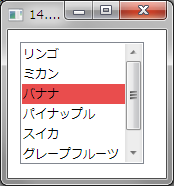
下記は、ハイライトカラーを赤(#FFE94D4D)に設定する例です。
XAMLの例
<Window.Resources>
    <Style x:Key="SimpleListBoxItem" TargetType="ListBoxItem">
        <Setter Property="FocusVisualStyle" Value="{x:Null}" />
        <Setter Property="Template">
            <Setter.Value>
                <ControlTemplate TargetType="ListBoxItem">
                    <Border Name="Border" Padding="1" SnapsToDevicePixels="true">
                        <ContentPresenter />
                    </Border>
                    <ControlTemplate.Triggers>
                        <Trigger Property="IsSelected" Value="true">
                        <Setter TargetName="Border" Property="Background" Value="#FFE94D4D"/>
                        </Trigger>
                    </ControlTemplate.Triggers>
                </ControlTemplate>
            </Setter.Value>
        </Setter>
    </Style>
</Window.Resources>
<Grid>
    <ListBox ItemContainerStyle="{StaticResource SimpleListBoxItem}">
        <ListBoxItem>リンゴ</ListBoxItem>
        <ListBoxItem>ミカン</ListBoxItem>
        <ListBoxItem IsSelected="True">バナナ</ListBoxItem>
        <ListBoxItem>パイナップル</ListBoxItem>
        <ListBoxItem>スイカ</ListBoxItem>
        <ListBoxItem>グレープフルーツ</ListBoxItem>
    </ListBox>
</Grid>
SilverlightのXAMLの例

<UserControl.Resources>
    <Style x:Key="ListBoxItemStyle1" TargetType="ListBoxItem">
        <Setter Property="Template">
            <Setter.Value>
                <ControlTemplate TargetType="ListBoxItem">
                    <Grid Background="{TemplateBinding Background}">
                        <VisualStateManager.VisualStateGroups>
                            <VisualStateGroup x:Name="SelectionStates">
                                <VisualState x:Name="Unselected" />
                                <VisualState x:Name="Selected">
                                    <Storyboard>
                                        <DoubleAnimation Duration="0" To=".75" Storyboard.TargetProperty="Opacity" Storyboard.TargetName="fillColor"/>
                                        <ColorAnimation Duration="0" To="#FFE94D4D" Storyboard.TargetProperty="(Shape.Fill).(SolidColorBrush.Color)" Storyboard.TargetName="fillColor" d:IsOptimized="True"/>
                                    </Storyboard>
                                </VisualState>
                                <VisualState x:Name="SelectedUnfocused"/>
                            </VisualStateGroup>
                        </VisualStateManager.VisualStateGroups>
                        <Rectangle x:Name="fillColor" Fill="#FFBADDE9" IsHitTestVisible="False" Opacity="0" RadiusY="1" RadiusX="1"/>
                        <ContentPresenter x:Name="contentPresenter" ContentTemplate="{TemplateBinding ContentTemplate}"
                                          Content="{TemplateBinding Content}" HorizontalAlignment="{TemplateBinding HorizontalContentAlignment}"
                                          Margin="{TemplateBinding Padding}"/>
                    </Grid>
                </ControlTemplate>
            </Setter.Value>
        </Setter>
    </Style>
</UserControl.Resources>
<Grid x:Name="LayoutRoot">
    <sdk:Label Height="28" HorizontalAlignment="Left" Margin="12,12,0,0" Name="Label1" VerticalAlignment="Top" Width="616" Content="14.ハイライトカラーを設定する" FontSize="16" />
    <ListBox ItemContainerStyle="{StaticResource ListBoxItemStyle1}">
        <ListBoxItem Content="リンゴ" />
        <ListBoxItem Content="ミカン" />
        <ListBoxItem Content="バナナ" />
        <ListBoxItem Content="パイナップル" />
        <ListBoxItem Content="スイカ" />
        <ListBoxItem Content="グレープフルーツ" />
    </ListBox>
</Grid>