
アプリバーは、Windows ストア アプリケーションに、ナビゲーション機能やコマンド、ツールを表示します。
アプリバーはページの上部か下部、もしくはその両方に表示することが可能で、不要な時には非表示にすることができます。
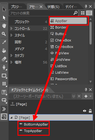
アプリケーションにアプリバーを追加するにはAppBarコントロールをPageに貼り付けます。
まず、Blendを起動して[アセット]タブにある[コントロール]からAppBarコントロールを見つけます。
見つけたら、AppBarコントロールを[オブジェクトとタイムライン]の[Page]にある[BottomAppBar]か[TopAppBar]にドラッグ&ドロップします(図1)。
ページの上部に配置する場合は[TopAppBar]、ページの下部に配置する場合は[BottomAppBar]です。
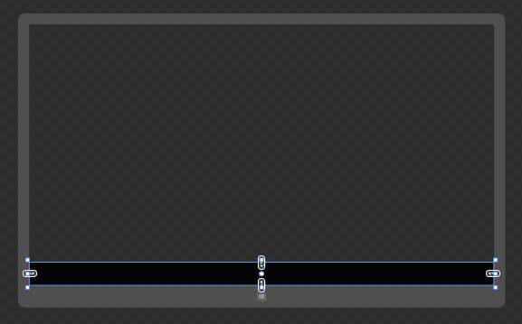
[BottomAppBar]にAppBarを配置すると、ページは図2のようになります。
AppBar追加後のXAMLはリスト1のようになり、AppBarはPageのBottomAppBarプロパティに追加されていることを確認できます。
リスト1 AppBar追加後のXAML
<Page.BottomAppBar>
	<AppBar>
		<Grid>
			<Grid.ColumnDefinitions>
				<ColumnDefinition/>
				<ColumnDefinition/>
			</Grid.ColumnDefinitions>
			<StackPanel Orientation="Horizontal"/>
			<StackPanel Grid.Column="1" HorizontalAlignment="Right" Orientation="Horizontal"/>
		</Grid>
	</AppBar>
</Page.BottomAppBar>
アプリバーに表示できるボタンはあらかじめ準備されているものがあります(もちろん自作のボタンも表示可能です)。
アプリバーに追加できるボタンは、プロジェクトのCommonフォルダのStandardStyles.xamlファイルに格納されています。
既定ではコメントになっているため、必要に応じて解除をします。
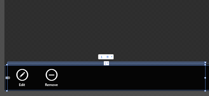
例としてEditAppBarButtonStyleとRemoveAppBarButtonStyleのコメントを解除して、PageのAppBarへボタンを追加してみます(リスト2)。
StandardStyles.xamlに定義されているボタンを使用するときは、ButtonコントロールのStyleプロパティで指定します。
リスト2 ボタンを追加する例
<Page.BottomAppBar>
	<AppBar>
		<Grid>
			<Grid.ColumnDefinitions>
				<ColumnDefinition/>
				<ColumnDefinition/>
			</Grid.ColumnDefinitions>
			<StackPanel Orientation="Horizontal">
			    <Button Style="{StaticResource EditAppBarButtonStyle}" Click="Button_Click"/>
                <Button Style="{StaticResource RemoveAppBarButtonStyle}" Click="Button_Click"/>
			</StackPanel>
			<StackPanel Grid.Column="1" HorizontalAlignment="Right" Orientation="Horizontal"/>
		</Grid>
	</AppBar>
</Page.BottomAppBar>
ボタンを追加するとPageは図3のようになります。
StandardStyles.xamlに定義されているボタンの画像は

で確認することができます。
興味がある人はぜひのぞいてみてください。

コメント