
Border コントロールは、その名の通り、枠線を作成するためのコントロールです。
単なる枠線として使用することもできますが、その他のコントロールの装飾用の枠線としても使用することができます。
幅、高さ、線の太さ、線の色を指定する
Border コントロールを使用するには、最低でも以下の4つのプロパティを指定する必要があります。
| プロパティ | 説明 |
|---|---|
| Width | 枠線の幅 |
| Heigth | 枠線の高さ |
| BorderThickness | 線の太さ |
| BorderBrush | 線の色 |
以下に XAML の例を示します。
<Border Width="100" Height="100" BorderThickness="1" BorderBrush="Black" />
<Border Width="150" Height="100" BorderThickness="5" BorderBrush="Blue" />
<Border Width="100" Height="150" BorderThickness="10" BorderBrush="Red" />
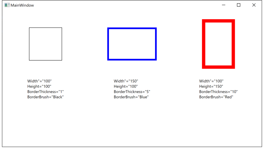
実行例
角丸枠線を作成する
角丸枠線を作成するには以下のプロパティを使用します。
| プロパティ | 説明 |
|---|---|
| CornerRadius | 角の半径。 全ての角の半径を同じ値で指定する場合は CornerRadius=”5″ のように指定。 全ての角の半径を別々に指定する場合は、CornerRadius=”左上 右上 右下 左下” のように指定。 |
以下に XAML の例を示します。
<Border Width="150" Height="150" BorderThickness="2" CornerRadius="5" BorderBrush="Black" />
<Border Width="150" Height="150" BorderThickness="2" CornerRadius="15" BorderBrush="Black" />
<Border Width="150" Height="150" BorderThickness="2" CornerRadius=" 5 10 15 20" BorderBrush="Black" />
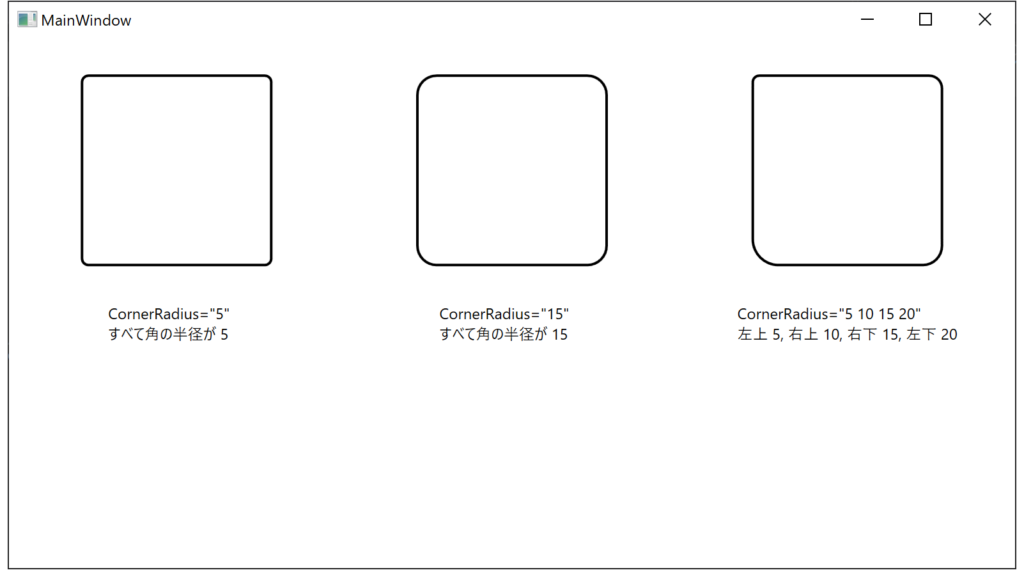
実行例
枠線内側の塗り潰し
枠線の内側を塗りつぶすには、以下のプロパティを使用します。
| プロパティ | 説明 |
|---|---|
| Background | 枠線の内側を塗りつぶす色を指定する。 |
以下に XAML の例を指定します。
<Border Width="150" Height="150" BorderThickness="2"
           BorderBrush="Black" Background="AliceBlue"></Border>
<Border Width="150" Height="150" BorderThickness="2"
           BorderBrush="Black" Background="BlueViolet"></Border>
<Border Width="150" Height="150" BorderThickness="2"
           BorderBrush="Black">
    <Border.Background&>
        <LinearGradientBrush EndPoint="0.5,1" StartPoint="0.5,0">
            <GradientStop Color="Black"/>
            <GradientStop Color="White" Offset="1"/>
        </LinearGradientBrush>
    </Border.Background>
</Border>
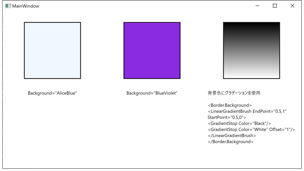
実行例
他のコントロールを枠線で装飾する
Border コントロールは、コンテナとしての役割もありますので、内側に他のコントロールを内包することができます。
このことを利用して、他のコントロールの装飾用のコントロールとしても利用可能です。
以下に例を示します。
この例では、画面の上段に通常のコントロールを、下段に Border で装飾したコントロールを表示しています。
<Grid>
    <Grid.ColumnDefinitions>
        <ColumnDefinition />
        <ColumnDefinition />
        <ColumnDefinition />
    </Grid.ColumnDefinitions>
    <Grid.RowDefinitions>
        <RowDefinition />
        <RowDefinition />
    </Grid.RowDefinitions>

    <!-- TextBlock の例 -->
    <TextBlock FontSize="18" Width="150" Height="20" Text="TextBlock"
                Grid.Column="0" Grid.Row="0" />

    <Border Width="150" Height="40" BorderThickness="4" CornerRadius="4"
            BorderBrush="Aqua" Background="Blue"
            Grid.Column="0" Grid.Row="1">
        <TextBlock FontSize="18" HorizontalAlignment="Center" Foreground="White" Text="TextBlock" />
    </Border>

    <!-- TextBox の例 -->
    <TextBox FontSize="14" Width="150" Height="20" Text="TextBox"
                Grid.Column="1" Grid.Row="0" />

    <Border Width="150" Height="40" BorderThickness="4" CornerRadius="4"
            BorderBrush="Aqua" Background="Blue"
            Grid.Column="1" Grid.Row="1">
        <TextBox FontSize="18" Text="TextBox" Margin="0" HorizontalAlignment="Left" Width="141" />
    </Border>

    <!-- Button の例 -->
    <Button FontSize="14" Width="150" Height="30" Content="Button"
            Grid.Column="2" Grid.Row="0" />

    <Border Width="150" Height="40" BorderThickness="4" CornerRadius="4"
            BorderBrush="Aqua" Background="Blue"
            Grid.Column="2" Grid.Row="1">
        <Button FontSize="18" Content="Button" Margin="0" HorizontalAlignment="Left" Width="141" />
    </Border>
</Grid>
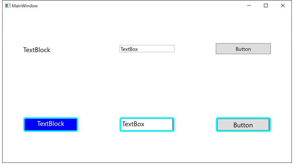
実行例
Please follow and like us:


コメント