
この記事では CommandBarFlyout を使用してポップアップするコマンドメニューを作成する基本について説明します。
環境
| 開発環境 | Microsoft Visual Studio Enterprise 2019 Version 16.11.5 |
| Framework | Microsoft .NET Framework Version 4.8.04161 |
コマンドメニューを作成する
コンテキストメニューは文字が中心の縦表示のメニューですが、CommandBarFlyout を使用すると、以下のようなアイコンを横に並べたポップアップメニューを作成することができます。
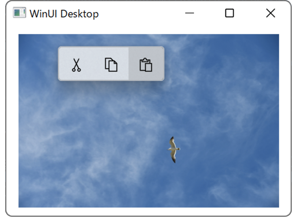
CommandBarFlyout によるポップアップメニューの例
以下は、画面に表示された画像を右クリックした時に「切り取り」「コピー」「貼り付け」のアイコンを横に並べたポップアップメニューを表示するコード例です。
XAML の例
<Window
    x:Class="WinUISample.MainWindow"
    xmlns="http://schemas.microsoft.com/winfx/2006/xaml/presentation"
    xmlns:x="http://schemas.microsoft.com/winfx/2006/xaml"
    xmlns:local="using:WinUISample"
    xmlns:d="http://schemas.microsoft.com/expression/blend/2008"
    xmlns:mc="http://schemas.openxmlformats.org/markup-compatibility/2006"
    mc:Ignorable="d">
    <Grid>
        <Grid.Resources>
            <CommandBarFlyout x:Name="ImageCommandsFlyout">
                <AppBarButton Icon="Cut" />
                <AppBarButton Icon="Copy" />
                <AppBarButton Icon="Paste" />
            </CommandBarFlyout>
        </Grid.Resources>

        <Image Source="Assets/DSC_0355.JPG" Width="300"
           FlyoutBase.AttachedFlyout="{x:Bind ImageCommandsFlyout}"
           ContextFlyout="{x:Bind ImageCommandsFlyout}"/>
    </Grid>

</Window>
画面(WIndow)には Grid を配置し、リソースとして <CommandBarFlyout> でポップアップメニューを定義しています。このとき、ポップアップメニューの名前を「ImageCommandsFlyout」にしています。メニューに表示するボタンは <AppBarButton> で定義し、表示するアイコンは Icon プロパティで設定します。
画面に表示する画像は <Image> で定義しています。右クリックした時にメニューを表示するには FlyoutBase.AttachedFlyout に先程定義した ポップアップに付けた名前「ImageCommandsFlyout」をバインドします。
Please follow and like us:

コメント