
概要
本記事では、WPFのToolbarコントロールの基本的な使用方法について解説します。Toolbarコントロールは、ユーザーがアプリケーションで頻繁に使用するコマンドやツールを簡単にアクセスできるようにするために使用されます。
構文
XAMLの構文
<ToolBar>
  <Button Content="ボタン1" />
  <Button Content="ボタン2" />
  <Button Content="ボタン3" />
</ToolBar>
コードビハインドの構文
ToolBar toolBar = new ToolBar();
Button button1 = new Button() {
  Content = "ボタン1"
};
Button button2 = new Button() {
  Content = "ボタン2"
};
Button button3 = new Button() {
  Content = "ボタン3"
};

toolBar.Items.Add(button1);
toolBar.Items.Add(button2);
toolBar.Items.Add(button3);
上記の構文では、ToolBar要素内にButton要素を配置しています。ToolBar要素はボタンやその他のコマンド要素を含むことができます。XAMLの場合、ToolBar要素とButton要素を直接配置します。コードビハインドの場合、ToolBarオブジェクトを作成し、そのItemsプロパティにボタンやコマンド要素を追加します。
使用例
XAMLの例
<ToolBar VerticalAlignment="Top">
  <Button Content="新規作成" />
  <Button Content="開く" />
  <Button Content="保存" />
</ToolBar>
コードビハインドの例
ToolBar toolBar = new ToolBar();
Button newButton = new Button() {
 Content = "新規作成"
};
Button openButton = new Button() {
 Content = "開く"
};
Button saveButton = new Button() {
  Content = "保存"
};

toolBar.Items.Add(newButton);
toolBar.Items.Add(openButton);
toolBar.Items.Add(saveButton);
上記の例では、ToolBarコントロールに新規作成、開く、保存という3つのボタンが配置されています。ユーザーはこれらのボタンをクリックすることで、対応するアクションを実行することができます。
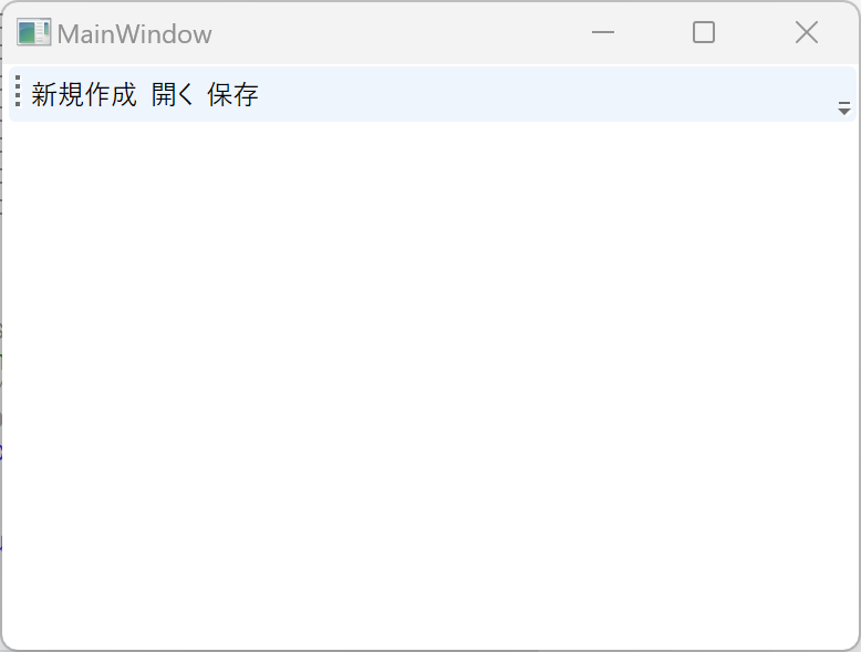
実行例
まとめ(続き)
本記事では、WPFのToolbarコントロールの基本的な使用方法について解説しました。Toolbarコントロールは、アプリケーションのユーザビリティを向上させるために重要な役割を果たします。適切なボタンやコマンドを配置し、ユーザーが頻繁に使用する機能に簡単にアクセスできるようにすることで、使いやすいインターフェースを提供することができます。
Please follow and like us:
コメント