
概要
この記事では、WPFのToolbarコントロールセパレータの使用方法について説明します。
構文
XAMLの構文
<ToolBar>
  <Button Content="Button 1" />
  <Separator />
  <Button Content="Button 2" />
</ToolBar>
コードビハインドの構文
ToolBar toolbar = new ToolBar();
Button button1 = new Button() {
  Content = "Button 1"
};
Separator separator = new Separator();
Button button2 = new Button() {
  Content = "Button 2" };
toolbar.Items.Add(button1);
toolbar.Items.Add(separator);
toolbar.Items.Add(button2);
Toolbarコントロール内にSeparatorコントロールを配置することで、ツールバー上でボタンとボタンの間に区切り線を表示することができます。
使用例
XAMLの例
<ToolBar>
  <Button Content="New" />
  <Separator />
  <Button Content ="Open" />
  <Separator />
  <Button Content="Save" />
</ToolBar>
コードビハインドの例
ToolBar toolbar = new ToolBar();
Button newButton = new Button() {
  Content = "New"
};
Separator separator1 = new Separator();
Button openButton = new Button() {
  Content = "Open"
};
Separator separator2 = new Separator();
Button saveButton = new Button() {
  Content = "Save"
};
toolbar.Items.Add(newButton);
toolbar.Items.Add(separator1);
toolbar.Items.Add(openButton);
toolbar.Items.Add(separator2);
toolbar.Items.Add(saveButton);
上記の例では、ツールバー内に「New」「Open」「Save」というボタンを配置し、その間に区切り線を表示しています。
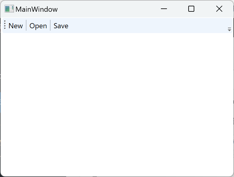
実行例
まとめ
Toolbarコントロールセパレータを使用することで、ツールバー上でボタンとボタンの間に区切り線を表示することができます。これにより、ツールバーの見た目を改善し、ボタンのグループ化やレイアウトの調整が容易になります。
Please follow and like us:

コメント