
概要
Styleプロパティは、WPF Buttonコントロールにおいてボタンのスタイルを変更するために使用されます。この記事では、初心者の方に向けてStyleプロパティを使ったボタンのスタイルの変更方法を解説します。
公式サイト情報はコチラを参照してください。
構文
Styleプロパティの構文は以下のようになります。
<Button Style="スタイル名">
  <!-- ボタンのコンテンツ -->
</Button>
スタイル名には、定義済みのスタイルまたは自作のスタイルを指定します。スタイルはXAMLで定義されることが一般的です。例えば、以下のようにスタイルを指定します。
<Button Style="{StaticResource MyButtonStyle}">
  <!-- ボタンのコンテンツ -->
</Button>
上記の例では、スタイル名として「MyButtonStyle」という自作のスタイルを指定しています。
使用例
以下の例は、Styleプロパティを使ったボタンのスタイルの変更方法を示しています。
<Window x:Class="WpfSample.MainWindow"
        xmlns="http://schemas.microsoft.com/winfx/2006/xaml/presentation"
        xmlns:x="http://schemas.microsoft.com/winfx/2006/xaml"
        xmlns:d="http://schemas.microsoft.com/expression/blend/2008"
        xmlns:mc="http://schemas.openxmlformats.org/markup-compatibility/2006"
        xmlns:local="clr-namespace:WpfSample"
        mc:Ignorable="d"
        Title="MainWindow" Height="200" Width="300">

    <Grid>
        <Button Content="Click Me"  Style="{StaticResource MyButtonStyle}">
            <!-- ボタンのコンテンツ -->
        </Button>
    </Grid> x
</Window>
上記のコードでは、ボタンのコンテンツとして”Click Me”というテキストを表示し、スタイル名として「MyButtonStyle」を指定したボタンが作成されます。
スタイルを使用することで、ボタンの外観や色、フォントなどを簡単に変更することができます。自作のスタイルを定義する場合には、XAML内でスタイルのプロパティを指定します。
スタイルを作成する
スタイルの作成例を以下に示します。
<Window.Resources>
    <Style x:Key="MyButtonStyle" TargetType="Button">
        <Setter Property="Background" Value="LightBlue"/>
        <Setter Property="Foreground" Value="White"/>
        <Setter Property="FontSize" Value="14"/>
        <Setter Property="Padding" Value="10"/>
        <Setter Property="BorderThickness" Value="2"/>
        <Setter Property="BorderBrush" Value="DarkBlue"/>
        <Setter Property="HorizontalAlignment" Value="Center"/>
        <Setter Property="VerticalAlignment" Value="Center"/>
        <Setter Property="Margin" Value="5"/>
        <Setter Property="Template">
            <Setter.Value>
                <ControlTemplate TargetType="Button">
                    <Border Background="{TemplateBinding Background}"
                            BorderBrush="{TemplateBinding BorderBrush}"
                            BorderThickness="{TemplateBinding BorderThickness}"
                            Padding="{TemplateBinding Padding}">
                        <ContentPresenter HorizontalAlignment="Center"
                                          VerticalAlignment="Center"/>
                    </Border>
                </ControlTemplate>
            </Setter.Value>
        </Setter>
    </Style>
</Window.Resources>
上記の例では、WindowのResourcesセクション内に「MyButtonStyle」という名前のStyleが定義されています。このStyleはButtonコントロールを対象にしています。
Style内で、さまざまなプロパティの値を設定しています。例えば、BackgroundプロパティをLightBlue、ForegroundプロパティをWhite、FontSizeプロパティを14などに設定しています。
また、Templateプロパティを使用して、ボタンのテンプレートを定義しています。テンプレート内の要素には、ボタンの表示内容が含まれます。
このようにStyleを作成すると、ボタンの外観や挙動を一括で変更することができます。作成したStyleは、ボタンなどのコントロールのStyleプロパティに適用することで使用することができます。
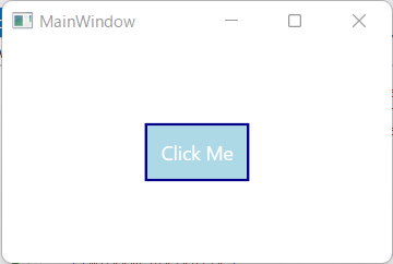
実行例
コメント